Choosing the cover of my first novel was hard. I had absolutely no idea what goes into designing a book cover.
The strongest reason to design a great book cover is that it functions as your most crucial marketing tool. The cover creates the first impression on its potential readers. A great cover design draws the attention of potential readers away from all those other books in the bookshop. But I did not know anything beyond that. I thought I will bring out the designer in me. But that designer had no clue. See evidence below.
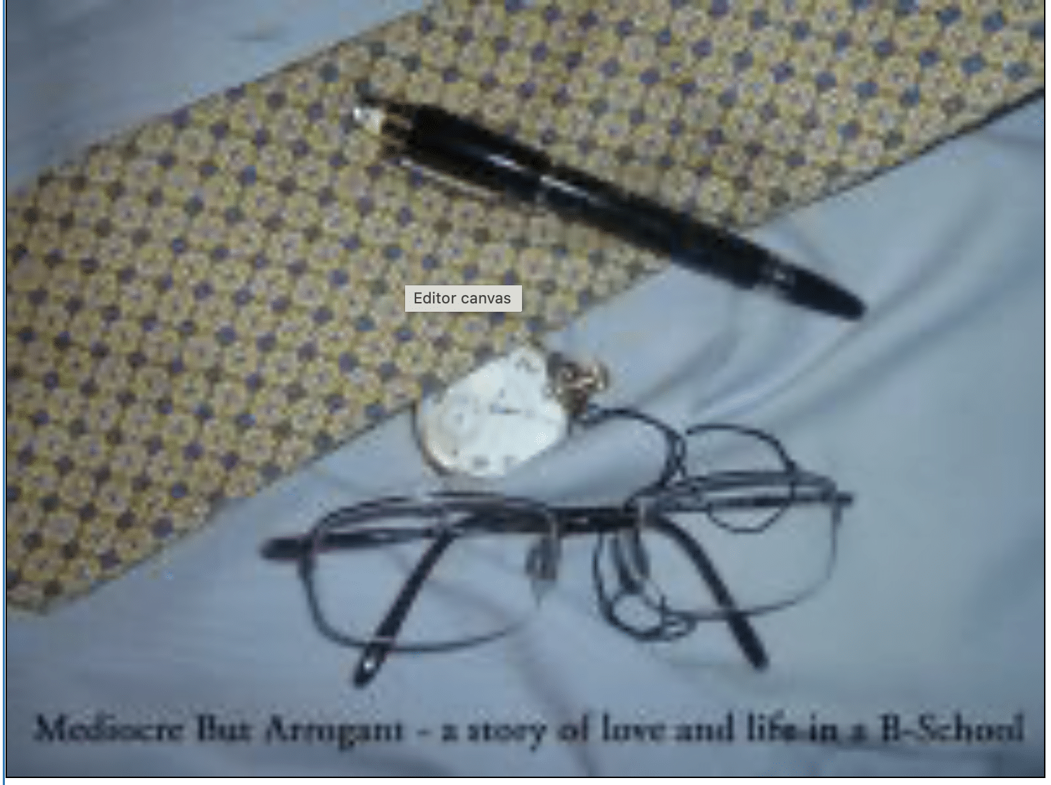
When the book Mediocre But Arrogant was being launched I was toying with options for the cover. This almost became the cover photo.
Someone suggested that I put up the cover option on the blog and seek opinions. What you see here is just a few of the responses. The summary of the judgement: NO GO!!
12 Comments
looks kinda too formal
Any additions that you can do to lighten it up?
i agree with gautam…thoda corporate lag raha hai like its a novel of only the job interview days…a bit more of spice reqd…….i suggest a pic of ganauri and a’s eyes competing for space……(btw now i know where my tie and pen went..lol)
While the cover looks classy, I think it doesn’t “really” offer anything new. I really really liked the more personalized sketches that I saw in your “dinghy workroom” 🙂 There’s so much more to the novel than the typical symbols of a business school (tie, glasses etc..) Yeah..some color to the cover would be a great idea. I can’t wait to read the book when it comes out. Allll the best to you! 🙂
– Dia.
Hey Abhijit,
Think of some other CoverPage man…This is too formal…Ad some B’school spice…
Ketan
mujhe to yeh Placement Interview ke liye Mahatma Gandhi ki wardrobe lagti hai
;0)
Hi everyone! Thanks for the feedback!! Whew, those were strong sentiments indeed!! Point taken. The book will have a different cover.
– Abhijit
am sure the book will make interesting reading as one can relive ones college days through it.
-rajan
Hey man!
Thank god for the change in cover, though symbolic i doubt anyone would have got it. i know how much hard work and dedication has gone into this and i wish u the best of luck with ur venture. in the 17 years that i have known you i think this is one of the happiest you have been! kudos to u!
ciao!
pini
Use the sketches on the cover. stingy Bashonto is droll, Haathi on the motorbike comes a good second. Of course, Ayeesha’s eyes are exquisite – very romantic.
College doesn’t come alive until some wicked nicknames stick.
Your note pad postings capture some of that rascally spirit of our younger days. Makes me nostalgic.
The book cover is apt to the theme of the novel.It is in sync with the corporate profile the biz school kids aspire after.However, the watch seem a little odd with the present day set of yuppies who sport Rolex or Cartier or at the most fashionable foreign brands. Does anyone sport a pocket watch however expensive and fashionable it is?
The color could have been a bit more bright and the name prominently displayed on the top. However, though first impression counts, it is the content of the book (and of course the price!)that matters in the long run.
Looking forward to it Abhijit.
Hey I loved Abbey’s doodles in his classes..they were so ‘real life’
It’s good,it got dumped. 🙂